
| 일 | 월 | 화 | 수 | 목 | 금 | 토 |
|---|---|---|---|---|---|---|
| 1 | 2 | 3 | ||||
| 4 | 5 | 6 | 7 | 8 | 9 | 10 |
| 11 | 12 | 13 | 14 | 15 | 16 | 17 |
| 18 | 19 | 20 | 21 | 22 | 23 | 24 |
| 25 | 26 | 27 | 28 | 29 | 30 | 31 |
- github
- 액션과 계산 데이터
- os_log
- unittest
- IOS
- ChatGPT
- 쏙쏙 들어오는 함수형 코딩
- SwiftUI VStack
- xcode
- 함수형 프로그래밍
- swift CI 적용
- CI
- XCTest
- Firebase
- print 단점
- combine
- flutter
- 오픈소스
- SwiftUI
- 하드디스크 삭제 원리
- 함수형 코딩
- auto_assign
- Swift
- Swift thread
- swift github action
- Apple Developer Academy @ POSTECH
- 2기화이팅
- firestore
- LGTM
- MVVM
- Today
- Total
개발공방
SwiftUI GroupBox or VStack (+ Flutter) 본문
SwiftUI를 좀 끄적여 본 사람이라면 제목에서부터 이상함을 느꼈을지 모른다.
SwiftUI를 접한지 일주일도 안됬을때 SwiftUI로 앱을 만들어야 했는데, 당시엔 네모박스를 만드는 법 조차 몰랐다.
MainView에 들어갈 카드모양의 View가 필요했다.
앱개발을 Flutter로 먼저 해봐서 얼추 어떻게 만들어야할지 감은 잡혔었다.
Flutter의 방식이라면
1. Container로 큰 네모상자를 만들고
2. 내부 child에 Colunm을 받고
3. 내부 children에 각각의 텍스트, 버튼 위젯을 넣고
4. Column의 alignment로 간격을 조절하면 되겠다
라고 생각했다.

import 'package:flutter/material.dart';
import 'package:flutter_sfsymbols/flutter_sfsymbols.dart';
import 'package:get/get.dart';

class MainPage extends StatelessWidget {
  @override
  Widget build(BuildContext context) {
    return Scaffold(
      appBar: AppBar(
        title: Text(
          '고민씨',
          style:
              TextStyle(color: Color(0xffdc8d6c), fontWeight: FontWeight.bold),
        ),
        actions: [
          Padding(
            padding: const EdgeInsets.all(10.0),
            child: Icon(SFSymbols.square_pencil,
                size: 28, color: Color(0xff788c62)),
          )
        ],
        centerTitle: false,
        backgroundColor: Colors.transparent,
        elevation: 0,
      ),
      body: Padding(
        padding: const EdgeInsets.all(16.0),
        child: Column(
          mainAxisAlignment: MainAxisAlignment.center,
          crossAxisAlignment: CrossAxisAlignment.center,
          children: [
            Container(
              width: double.infinity,
              height: context.mediaQuery.size.height * 0.4,
              decoration: BoxDecoration(
                  gradient: LinearGradient(
                      colors: [Color(0xffC5AC9A), Color(0xffE2D7CD)],
                      begin: Alignment.topLeft,
                      end: Alignment.bottomRight),
                  borderRadius: BorderRadius.circular(10)),
              child: Padding(
                padding: const EdgeInsets.all(16),
                child: Column(
                  mainAxisAlignment: MainAxisAlignment.spaceAround,
                  crossAxisAlignment: CrossAxisAlignment.start,
                  children: [
                    Text(
                      '22.04.05 (화)',
                      style: TextStyle(
                          color: Colors.white,
                          fontSize: 16,
                          fontWeight: FontWeight.bold),
                    ),
                    Text(
                      'Chemi님은 뭘 할때   행복한가요?',
                      style: TextStyle(
                          color: Colors.white,
                          fontSize: 35,
                          fontWeight: FontWeight.bold),
                    ),
                    Container(
                      width: 50,
                      height: 30,
                      decoration: BoxDecoration(
                        color: Colors.white,
                        borderRadius: BorderRadius.circular(20),
                      ),
                      child: Center(
                        child: Text(
                          '가치관',
                          style: TextStyle(
                            color: Color(0xffC5AC9A),
                          ),
                        ),
                      ),
                    ),
                    Row(
                      mainAxisAlignment: MainAxisAlignment.end,
                      children: [
                        Container(
                          width: 60,
                          height: 30,
                          decoration: BoxDecoration(
                              color: Colors.white,
                              borderRadius: BorderRadius.circular(10)),
                          child: Center(
                            child: Text(
                              '제출하기',
                              style: TextStyle(color: Color(0xff788c62)),
                            ),
                          ),
                        ),
                      ],
                    ),
                  ],
                ),
              ),
            ),
          ],
        ),
      ),
    );
  }
}
SwiftUI에서도 비슷한 방식일거라 생각했다.
그래서 우선 큰 네모상자를 만들어야겠다고 생각을 했다.
네모상자를 만드는 방법부터 구글링하기가 난감했다.
이상하리만큼 정보가 안나온다 생각을 하다, 찰나에 나온 정보가 GroupBox로 구현하는 것이었다.
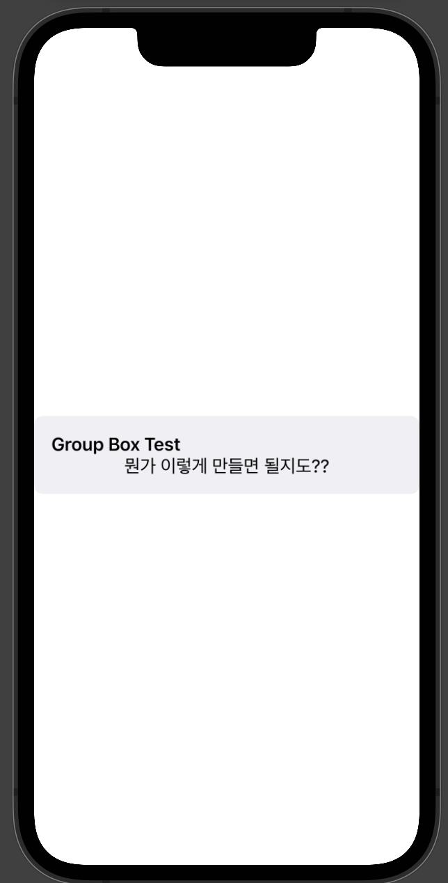
뭔가 이런식으로 만들어서 색깔만 잘 바꾸면 되겠다 생각이 들어서 처음엔 GroupBox로 구현을 시작했다.
최종적으로 구현이 불가능했진 않지만, 코드가 굉장히 난잡했고
GroupBoxStyle을 struct로 빼서 구현하고 코드를 이해하는데에 초보자로써 쉽지않았다.
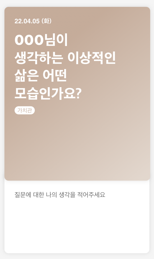
어찌저찌 만든 화면이
색깔을 프로젝트 진행중에 조금씩 얘기해서 수정한 색이라 Hi-Fi랑 조금은 다르다.
글자들 사이의 간격 조절이나 세부적인 디테일은 자연스럽게 타협을 했다.
프로젝트 기간이 얼마 없을때여서 아쉬운대로 완성화면을 만들었다.
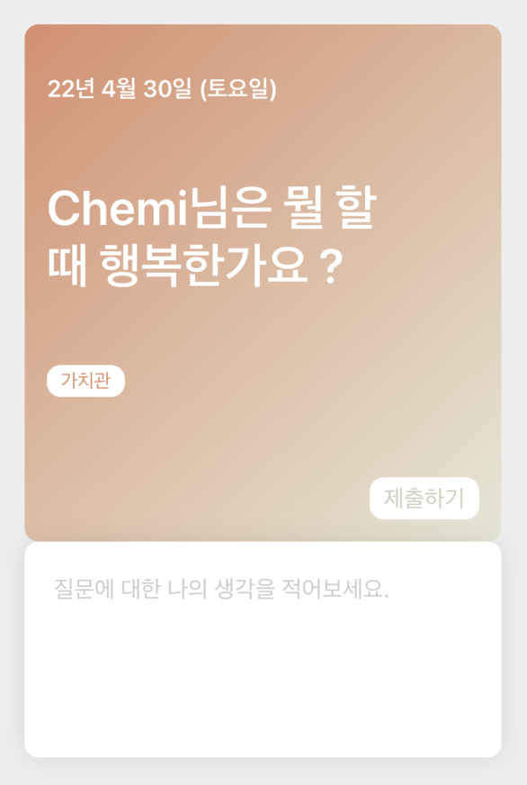
이후 시간이 있을때 리팩토링을 하는 과정에서 GroupBox로 만드는게 아니라 VStack으로 만들어야 했음을 깨달았다.
처음 구현할때보단 SwiftUI에 익숙해져서 VStack으로는 어렵지 않게 만들었다.
최종 완성UI는 똑같이 나왔다.
VStack(alignment: .leading) {
                    Text("\(today, formatter: MainView.dateformat)")
                        .bold()
                        .padding(.top, 20)
                    Text(dailyQuestion)
                        .dailyQuestion()
                    .frame(width: geometry.size.width * 0.8, height: cardTextHeight, alignment: .leading)

                    HStack {
                        ForEach(categoryList, id: \.self) { value in
                            Text(value).padding(.vertical, 3)
                                .padding(.horizontal, 10)
                                .foregroundColor(Color.primaryColor)
                                .background(RoundedRectangle(cornerRadius: 10))
                                .font(.system(size: 14))
                        }
                    }

                    Button("제출하기", action: answerText.count == 0
                           || answerText == "질문에 대한 나의 생각을 적어보세요."
                           ? { }
                           : {
                            showAlert = true
                            answerText = "질문에 대한 나의 생각을 적어보세요."
                            hideKeyboard()
                            answerColor = Color.black.opacity(0.2)
                            cardHeight = UIScreen.main.bounds.height * 0.45
                            cardTextHeight = geometry.size.height * 0.2
                        })
                        .foregroundColor(answerText.count == 0
                                         || answerText == "질문에 대한 나의 생각을 적어보세요."
                                         ? Color.mainGreen.opacity(0.4)
                                         : Color.mainGreen)
                        .padding(EdgeInsets(top: 5, leading: 10, bottom: 5, trailing: 10))
                        .background(
                        RoundedRectangle(cornerRadius: 10))
                        .alert(isPresented: $showAlert) {
                        Alert(
                            title: Text("제출 완료"),
                            message: Text("마이페이지에서 확인할 수 있어요!"),
                            primaryButton: .default(Text("보러가기")),
                            secondaryButton: .cancel(Text("완료"), action: {
                                    tapTextEditor = false
                                }))
                    }
                        .padding(.top, 50)
                        .frame(width: geometry.size.width * 0.8, alignment: .trailing)
                }
                    .padding()
                    .background(LinearGradient(
                    gradient: Gradient(colors: [Color.primaryColor, Color.subIvory]),
                    startPoint: .topLeading, endPoint: .bottomTrailing))
                    .foregroundColor(.white)
                    .cornerRadius(10)
- MainView의 일부 코드
결론 : 같은 UI를 GroupBox와 VStack으로 둘 다 똑같이 구현할 수 있지만, refactoring과정과 코드 수정을 감안한다면 VStack이 좀 더 좋은 방법인 것 같다. 나처럼 아예 몰랐던 사람들에게 도움이 됬으면 좋겠다. 특히 flutter로 앱개발 하다 SwiftUI로 넘어온 사람들은 비슷한 상황을 겪을 것 같다. 그들에게 조금이나마 가이드라인이 되길 바란다.
아래쪽 TextField를 구현하면서도 꽤나 골칫거리가 된 부분이 있었는데 추후에 해결 방법과 같이 포스팅 해야겠다.
'Swift > SwiftUI' 카테고리의 다른 글
| SwiftUI Firebase firestore 연동 (2) (0) | 2022.05.14 |
|---|---|
| SwiftUI Firebase firestore 연동 (1) (2) | 2022.05.11 |

